

It’s the shitty contagion of Flat design. Back around 10 years ago or so, the Flat craze began and everything that had details or depth was pounded down into simple flat design. Now everything has to look basic and boring, and it sucks.
I really like the simplicity of flat design. It makes things easier to find and recognize, especially for icons. Also easier for people with poor eyesight. It caught on for a reason.
Lemmy loves to shit on designers but there’s no way the designer had the autonomy to come up with this on their own. 100% guaranteed this idea came from marketing or an executive.
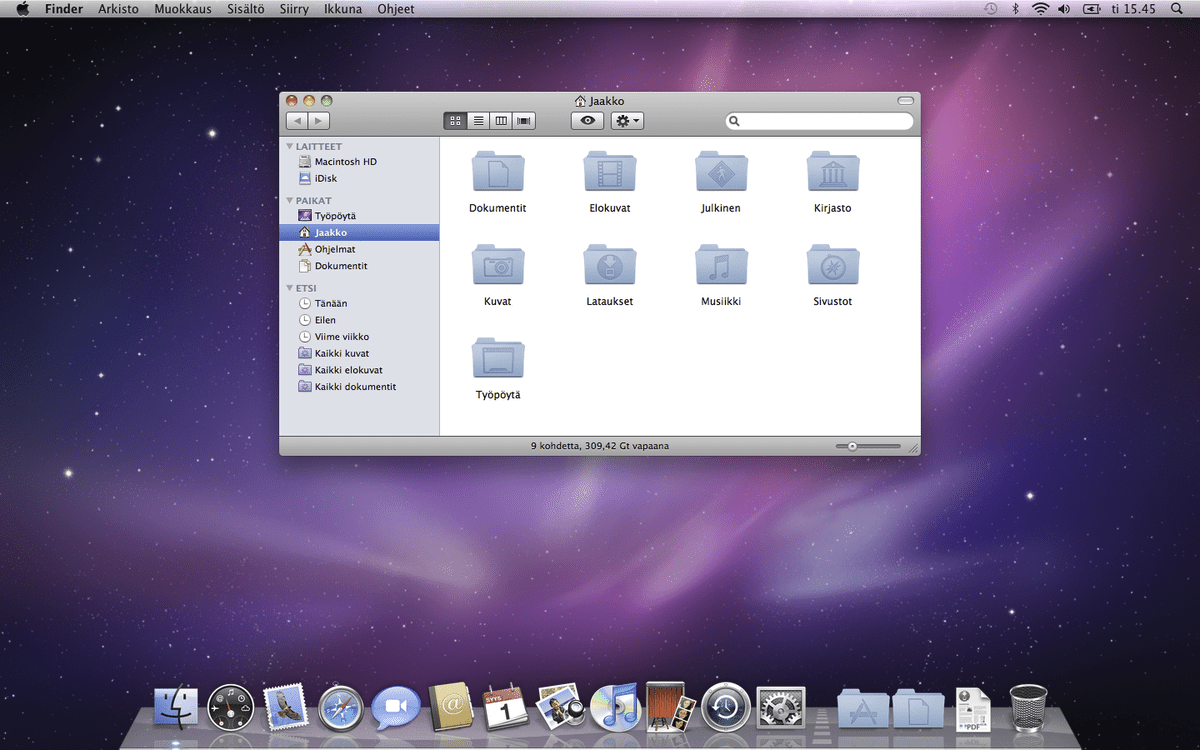
I don’t like flat design because it’s basic, boring, and sad. Windows 10 and 8 were ugly flat boring UIs for example. IMO peak GUI design was Mac OS X 10.6 like this:
Full skeuomorphism out the ass
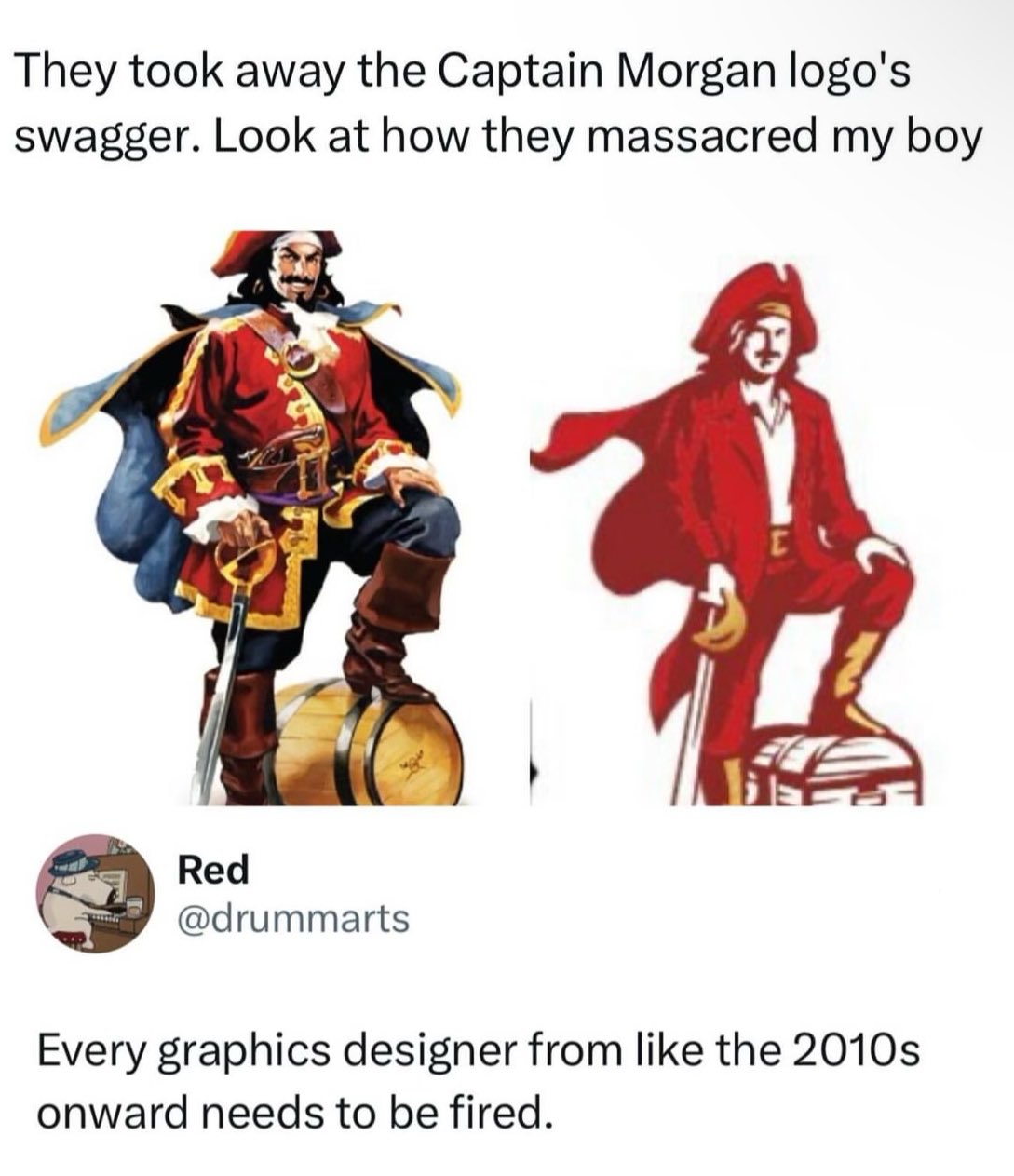
Why did they replace the barrel with a chest? Come on guys, this isn’t hard. The barrel is rum, the rum is the treasure. Smh
And why the fuck is he wearing a suit?
I think it clearly pictures the company CEO’s values. The suits and their chest full of profit money they want to keep all to themselves.
Or maybe the people buying this rum see themselves as successful business men who are buying this run because they have so much treasure.