

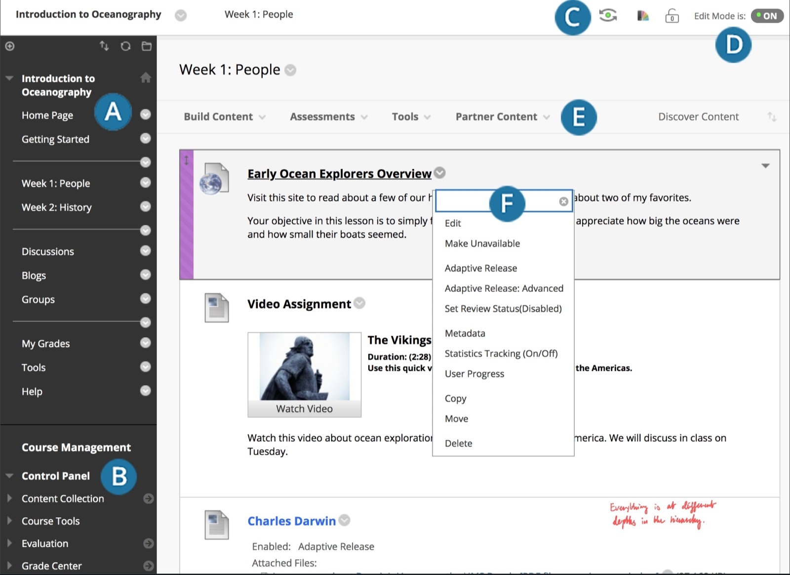
I have to navigate an interface like this to access resources from my school and it jams my brain. I don’t know if it’s badly designed but my brain doesn’t know what to click or where to point my eyes when I’m looking for something. I literally have to read each element, visualize what the words represent, and compare it to a visualisation of the thing I’m looking for to guess what I need to click on which proves to be very cognitively straining. I know it sounds pathetically simple but it is an additional dopamine hurdle I have to overcome before I can do any homework or revision. I don’t have this problem on most webpages. I wonder whether it could be ADHD related because my classmates always seem to find relevant resources in the system for things that I turn to Google for because this page is so impermeable.
Here’s another example:

What beats me is how people like to say how 90s’ webpages looked horrible. But when I get to a miraculously still functional webpage with 90s’ web design, I feel like I’m walking in a park. Then I get to something such people would call a normal webpage, and I can’t use it. I ask such people and they … are not interested in actually finding something in the pile of crap they call better.
This is because its all old and straight to the point. No caveats, no javascript bs, no huge buttons or long loading shit, no css that moves shit around or doesnt work on that one machine with a certain resolution.
It. Just. Works.