

More info about it here: https://www.ghacks.net/2024/08/13/windows-11-start-menu-is-getting-a-new-layout-to-organize-your-apps/
I love how microsoft never learns their lessons.
Looks even worse than the one they had before
Ugh, fine Microsoft. I’ll finish my migration to Linux this weekend.

I tried it but stopped once I realised there was no hdr support :(
Depends on your desktop environment. HDR works just fine in KDE.
Not sure why you’re getting downvoted. It literally only exists on a single desktop environment and even then it’s practically beta. On my TV it just shows everyhing as green and purple when I enable HDR.
I love linux and want it to keep improving but man people need to stop circlejerking linux so much when it comes to people using windows when it suits their needs
It’s true that HDR support is virtually non-existent being limited to very recent KDE wayland with bleeding edge everything and AMD hardware. Basically .33 * 0.05 * 0.3 or like 1/2 of 1% of Linux users.
It’s also true that is a weird ass thing to chose a desktop OS for.
Someone made a post about enabling HDR support on Linux a day or two ago. Times have changed, and you might want to look into it again.
(I don’t have HDR monitors, but it works on my OLED Steam Deck.)
The Steam Deck is an exception to the rule, unfortunately. Game mode runs using Gamescope as the compositor, which allows it to directly manage rendering surfaces and support HDR output.
Support for HDR under a regular DE is still either nonexistent or a work-in-progress last I checked.
KDE has experimental HDR support already
It’s been a hot minute, but they might have gotten HDR through some gamescope trickery. Sounds vaguely familiar…
Was this a call for help or…?
There is HDR support. At least Plasma 6 supports it.
How do you know and learn this stuff? i dont even know what “plasma” is and why you need it.
“Just use linux” doesnt help in this scenario i use it for productivity for the past 5 years but i havent felt ive really learned shit.
Plasma is the desktop environment developed by KDE. It’s for example desktop environment used by SteamOS 3.
As to how you learn this stuff: looking things up on the search engine of your choice helps. Not trying to be rude here, but you could have found all of that out yourself by searching for “plasma Linux”: https://lmddgtfy.net/?q=plasma linux
Also the arch wiki. There you can find all the info you could ever ask for.
" yust use Linux" is a great piece of advice for most people because most people don’t care about the OS they use. They just use it. And they shouldn’t need to take a course to do so. Of course you are missing some things with this.
If you want more than you will need to go out and actively look for it
Sorry i didnt explain myself well and no dont worry youre not being rude.
My point wasn’t, “what is this i dont know please tell me” but more in line with “how do you guys keep on top of this information and know whats current”
How do you learn this stuff?
The same way you got your knowledge about Windows 🙂
But I dont know anything about windows drivers?
Some games support it on windows but not Linux. The list is small. That said, windows HDR support is garbage ime. I don’t feel like there’s a good option that’s set and forget in any case.
Plasma/wayland integration is coming along but it’s not there yet for HDR in gaming.
I just said screw it and live without it. Forgot i cared after 20min.
Can’t miss what I’ve never had, suppose I’m lucky there - HDR might as well not exist (in my mind) until it does exist on GNU+Linux.
Unpopular opinion: HDR is overrated and causes more eye fatigue.
I guess it really is an unpopular opion. Lol. I have have eye fatigue issues with HDR too, though.
I also can’t watch 3D for more than 5 minutes without getting a migraine. I don’t know enough about how the display works to know why. Both feel like it is trying to fool my eyes and my brain doesn’t like it. Maybe my eyes/brain get fatigued trying to play along. Some types of HDR seem to bother me more than others. I can watch an HDR movie mostly fine.
It takes some fiddling, but I’ve been using HDR on Linux since Plasma 6 came out. If you don’t have an AMD GPU it would probably be really difficult to set up though.
I use Wayland/Plasma6 with a 6800xt and it just works out of the box (OpenSuse TW)
Welcome. We have cake and assorted treats.
Another 500k lines of new code? Yay more bloat!
After Microsoft Edge decided to import all my chrome passwords and data I decided to get rid of windows as much as possible.
With more room for ads, I hope?!
i assume that’s what the sidebar is for
The sidebar looks like it’s dedicated to phone access?
it is, that was just me trying to be funny
My bad, I got whooshed
"Why are you using Firefox? Didn’t you know edge is better?
Are you sure you don’t want to try edge?
I’ll fuckin murder you if you don’t launch edge right now. "
-windows these days.
Looks like someone at Microsoft saw someone’s iPad and went “That’s what we need! Icons in boxes that need an extra click to be used!” and their MBA boss figures they’ll get a bonus for “increasing user engagement” by making everything take two actions instead of one now.
Sigh.
From the linked article:
One interesting thing about it is that clicking on an icon instantly launches the app, without opening the folder.
Isn’t that what start menu icons do already?
Yeah but soon they’ll be automatically grouped together into something that looks like folders
200%+ engagement ratio
Llol, it’s funny but also probably true. God I hate statistics and MBAs.
oh yeah, now one can accidentally close the Start menu by clicking in the gap between the panels.
Microsoft can not stop fucking up. I have to wonder what the turnaround is like on their UI teams that every god damn version needs a complete rework.
It’s not just Microsoft… Most big companies are absolute trash. Google, Apple, Microsoft… They’re all garbage, and they’re bad for us.
I like the Phone Companion bar too. The folder grid is reminiscent of Windows 8 and is a nod to iOS… I guess haters gonna hate, but this seems like a nice improvement.
I’ll be over here hating then.
This is the Window 8 menu bullshit all over again.
I genuinely don’t understand what more people could want in a start menu, just needlessly against all forward momentum and change?
Just against pointless change.
You can see your phones status and recent messages from the start menu now! More start menu icons are exposed in the space they’ve added an organization mechanism. I think the point is to improve its usefulness
My personal phone is not linked to my computer. My work computer will never be linked to my work computer because I don’t have a work provided mobile phone. I do expect this new menu to nag the shit out of me to link a phone based on prior Windows ‘features’.
I don’t use windows messages.
I see fewer icons in the preview image than I see on the start menu now.
This is far less useful than the existing menu, which is less useful than the windows 7 menu. This is like how they hid half the things I used on the right click menu under the ‘show more’ option.
Pretty sure the bar goes away when you don’t use Phone Link! I use Phone Link, as you should too assuming you own a phone. I like it because that + the iCloud app basically brings feature parity to my Macs built-in Phone integrations. The simping over Windows is bizarre, it’s like you guys are pissed that Windows 2000 isn’t still supported, come join us in the 21st century please. “Any feature I don’t personally use is pointless and bloat” is a childs argument.
“Everyone else should be subjected to my preferences” is also a child’s argument.
If i wanted a Mac I would buy one. They are great for people who like them, but their extremely integrated environment is used to justify exclusive software and hardware requirements that I don’t want to be limited to. Windows forcing an online account is aping Apple and I hate it.
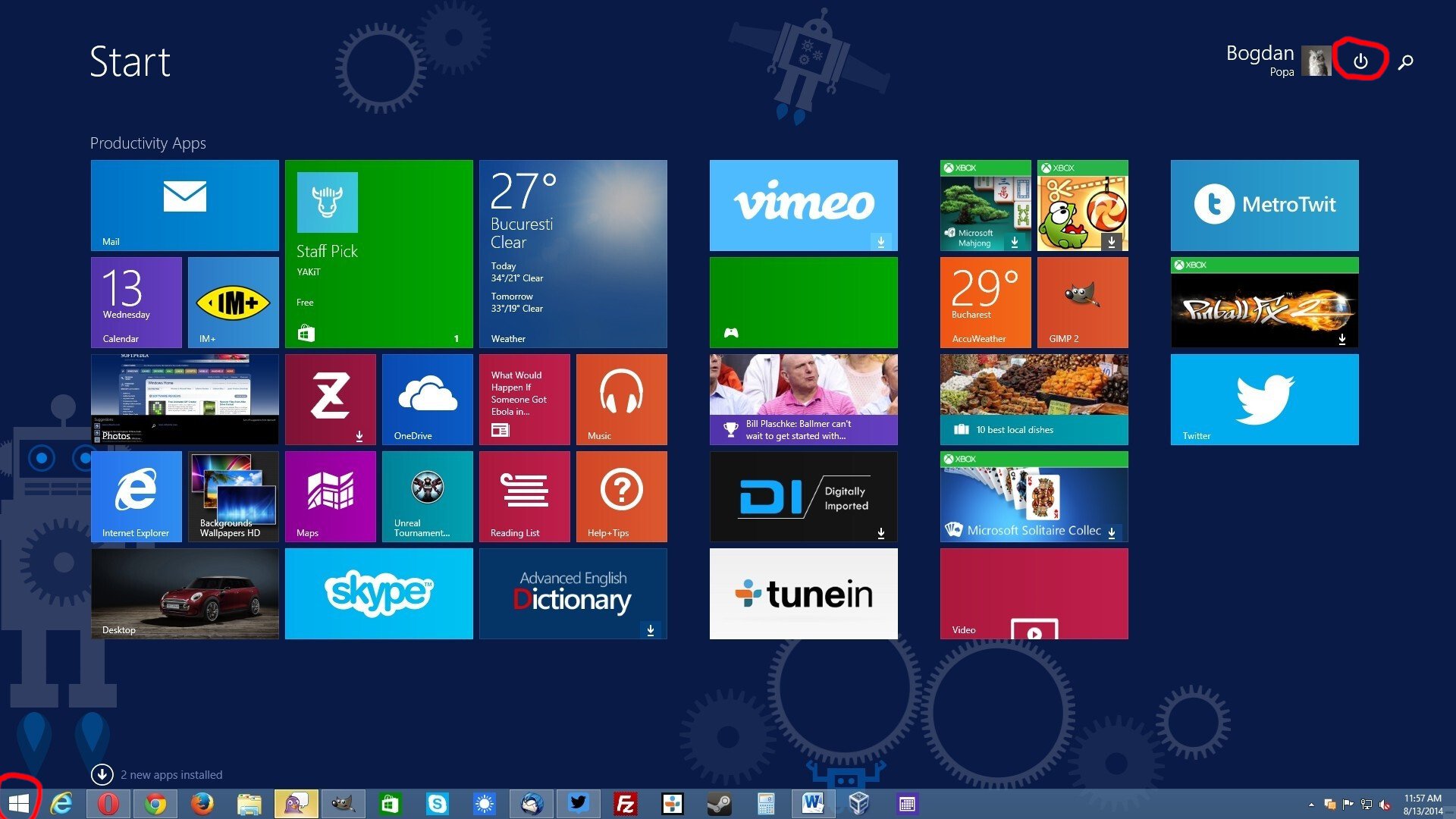
Oh cool, good to see the power button is still on the other side of the fucking menu. You know, the thing that I’m clicking on 90% of the time I’m opening the Start Menu? Why have that easily reachable like in past versions of Windows? Silly me I guess.
This isn’t the first time Microsoft has done this, I remember this being a huge gripe for me with Windows 8/8.1
Yeach the ui sucked, kinda sucked. I actually kinda liked it on 8.1 . But the one thing windows 8 did right was efficiency. I still remember my update from windows 8 to 10 when witcher 3 on my laptop went from barerly playbale to unplaybale. Sad story.
Strangly this UI always reminds me of the hospital scene from Idiocracy… Click the icon for where it hurts
Uh THIS one goes in your mouth
… wait, no.
With Windows 8, they all hurt.
Hey that was when they thought it was also a smart idea to force that shit tablet view on users…
I didn’t mind it actually. Like I don’t mind the GNOME overview or whatever the thing that comes up when you press Meta is called
I guess the difference is that the Gnome overview has been thought out amazingly, has a fantastic search function that actually works, and Gnome takes heavy advantage of their superb implementation of workspaces (virtual desktops).
Gnome doesn’t really feel designed for tablets, it feels designed for everything. Hot corners, large click targets, and having good keyboard shortcuts makes it feel good on a desktop, amazing trackpad gestures make it feel at home on a laptop.
Win8 had options scattered everywhere, a search that was just starting to turn bad, and initially did silly things like only let you use one app at a time, no matter your screen size. It was forcing a tablet UX that just felt wrong on a PC.
I think Microsoft were hoping thin and light foldable/tablet devices (that were all the rage at that point) were a good way to sell more windows licenses (thin and lights are weaker hardware so will likely need updated more to keep up with performance demands), hinges are weak points so hardware will be replaced more, all meaning more licenses sold. They were trying to force Windows down this path, IMO.
Come on, it’s totally intuitive! Just put your mouse in the top right corner, off the screen, and swipe down to make the “charms” bar slide out from the side.
Wait, what?
i love the workflow of gnome, it takes time to get used to but its really nice
Gnome is still a bit quirky to me and I’ve been running it on my latest install. I still don’t get their idea of by default, without extensions, how I’m supposed to use software that requires a tray icon to use.
And they did it on Windows Server too, which made even less sense.
You mean you didn’t use touch screen monitors on your servers?
Don’t your servers run on phones?
Then you wouldn’t notice all the fun and exciting recommendations they have for you! /s
genuine question, why do you click that button? Why not use the physical button on the device?
I’m sitting at my desk and my computer tower is out of reach unless I get up and reach over. Gotta showcase that RGB
Software shutdown button presser chiming in.
There’s two reasons I tend to use the software button. I know for a fact that clicking “Shut Down” will actually shut down the computer. If I press the hardware button, the computer usually is configured by default to sleep. Yes, I could change this default behaviour on all the devices I use, but then there’s the second reason:
From a psychological perspective, I tend to associate the hardware button as a “only use if system is locked up” button.
Yep, if you’re in charge of managing hundreds of computers, you don’t want to guess at what it’ll do. We have our defaults but also have people who make exceptions depending on their own work needs. Tbh, I rarely use that button anyhow though, I right click on the start menu to get that menu instead and use shutdown, restart, or log out.
Further reason, the physical button isn’t always in a location that’s convenient to push. Sure it’s usually accessible, but sometimes it’s under a desk or behind a monitor or some other awkward location. Mouse and keyboard by their nature are always located in a conveniently accessible location.
Right click the start button instead
I was about to comment this. And to anyone saying they are taking that away we all know how bad they are at removing legacy options so I’m sure this will be here until at least windows 14.
If they didn’t take that away.
not yet, they haven’t.
Just wait. At the rate they’re going it won’t be long before you’re forced to sit through a 30 second full screen ad in order to even open the start menu.
30 Microsoft points have been deducted from your account, and therefore your Windows Personalization settings have been restricted. Please remember to never disparage our Experience Opportunities™ as “ads”, our Experience Opportunity Partners™ are valuable members of your family and help you learn about services and products you love and cherish!
For more information, please review the terms of the Microsoft Behavior Agreement you implicitly agreed to by being within 500m of a running Microsoft software product.
Power options: sleep after 5 minutes
Power button action: shutdown
You’re welcome
Alt+F4
Win+X > U > U
Shuts down your machine with no mouse required, use U > R if you wanna restart
This is the way
I just Alt + F4 from the desktop or just press the power button. I always change it to regular old shutdown.
agree on the power button change, unless you have little kids, in which case the button should just be disabled.
I saw other people mentioning managing multiple computers in an offise space. I wouldn’t trust that everybody wound configure the power button action.
i don’t understand what you mean exactly
Sorry if you already know but if you can also do win+x to get to shutdown menu
Win+x, u, u shuts down.
Cool, will this one work, or will it still go unresponsive and/or fail to find the app called the exact thing you typed?
it only changes the look, not how search works, unfortunately for windows users
ha, oh look another revision no one asked for.
i had to use this recently, and its all kinds of useless now. the ‘search’ didnt find my installed app, the ‘all apps’ list is a click or two in, and then absurdly inefficiently styled… the win98 start menu was easier for me to navigate.
Nobody asks for mayor UI changes, nothing would change of you wait for that.
sometimes things that are not broken need no fixing…
unless youre some middle management pos attempting to make your mark in a terrible corporate environment
Caves are perfect, why change anything?
We have always done it like this!
All terrible arguments.
Are you genuinely arguing that this start menu is better?
I love how modern UI = eating up as much space as possible, while displaying as little information as possible. Glad I can watch this shitshow from afar.
It’s hard to even take Windows seriously as a business OS when they’re shoving this overly padded UI down everyone’s throats. Windows 10 supported small task bars, among many other things that Windows 11 doesn’t. There seems to be a lot of really tone deaf people at Microsoft working in silos, not really aware of the features people care about in their own product.
Oh for fucks sake, auto categorization is one of the thing I dreaded the most on iOS because it’s almost always incorrect and it doesn’t fit my usage at all. Hopefully it will be possible to disable this crap.
Agreed. I miss live tiles, but I want full control over that menu.
Looks like MacOS and various Linux distros had a deformed, illegitimate child.
how lol? i see absolutely no influence from macOS or DEs
Right? That’s nothing like those… that’s insulting to MacOS and Linux.


