

New GNOME dialog on the right:

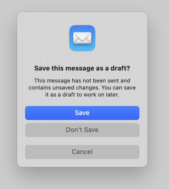
Apple’s dialog:
They say GNOME isn’t a copy of macOS but with time it has been getting really close. I don’t think this is a bad thing however they should just admit it and then put some real effort into cloning macOS instead of the crap they’re making right now.
Here’s the thing: Apple’s design you’ll find that they carefully included an extra margin between the “Don’t Save” and “Cancel” buttons. This avoid accidental clicks on the wrong button so that people don’t lose their work when they just want to click “Cancel”.
So much for the GNOME, vision and their expert usability team :P
As someone who tried out MacOS in a VM out of curiosity I don’t find gnome to be like MacOS at all in overall functionality. I think to most people it just looks like Mac because top bar, dock and some design choices. Really though gnome is much more like Android. MacOS felt extremely clunky to use vs gnome’s fluid workspace and app switching.
Top bar, dock, system settings, activities (somewhat e mix between Apple’s mission control and launchpad), now the modal buttons, accent colors… and so many other things.
Maybe you were running it without proper GPU acceleration and without a keyboard with actual macOS shortcuts on the function keys? Virtualizing macOS is hard and it will give you a very poor experience.
Obviously macOS has it’s defects but at least you aren’t risking losing your work due to a misclick nor you are restricted from having desktop icons like you’re on GNOME :)
No I did not have GPU accel. I’m curious what you are referring to losing work due to a misclick? Personally I don’t use desktop icons. I’m a previous i3 user so I am used to using my computer with a non traditional interface.
If you place “Discard” and “Cancel” next to each other, without a margin in between, is easier a user looking to click on “Cancel” to click on “Discard” and lose a document. This is more common than people think and that’s why Apple added the margin there and also why any good UX manual tells you to add a margin for destructive operations like that one.
Not a permanent dock. Docks predate Apple any way.
GNOME 3 was officially launched a few months after OS X Lion, but combined these things into one first.
The Dock comes from NeXTSTEP, the operating system Steve Jobs left Apple to develop back in 1986… GNOME was announced in 1997 so I don’t get your argument.
NeXT is probably the pretty direct ancestor of osx dock. Only Apple turned it from good to bad by moving it to the bottom, where there is no space. And that only got worse as screens became wider, but not taller. And they made it overlap and obscure content and bounce around if you got near it making it extra obnoxious and hard to use.
Other docks existed even before, of course.
I’ve never lost anything because I misclicked. Ctrl+s is your friend.
See the problem there, regular users don’t Ctrl+s, they point and click.