

New GNOME dialog on the right:

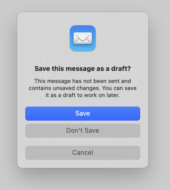
Apple’s dialog:
They say GNOME isn’t a copy of macOS but with time it has been getting really close. I don’t think this is a bad thing however they should just admit it and then put some real effort into cloning macOS instead of the crap they’re making right now.
Here’s the thing: Apple’s design you’ll find that they carefully included an extra margin between the “Don’t Save” and “Cancel” buttons. This avoid accidental clicks on the wrong button so that people don’t lose their work when they just want to click “Cancel”.
So much for the GNOME, vision and their expert usability team :P
I’ve only spent a few hours on my wife’s MacBook Pro which was still running Catalina (now Fedora) back in the days, and I didn’t think Gnome and MacOs were so similar.
To be honest I felt a bit lost on MacOs Catalina and felt like everything was difficult compared to Gnome.
But I guess Gnome is taking a lot of inspiration from the MacOs aesthetic, and it’s okay with me because it looks great.
I don’t have a lot of experience with other DE on Linux, but they lack the clean aesthetic of Gnome.
Just because you aren’t used to the macOS workflow it doesn’t mean it is bad - that’s the same argument you GNOME fan boys do with Windows users ;)
Yes, it’s okay, and that was never an issue in this discussion. The issue is that they didn’t took enough inspiration on basic UX patterns.