Every new Android version adds features that have been on iOS forever. Both OSes have different priorities.
Android will often add new features but they are poorly integrated or thought out. iOS tends to add features with a much higher level of refinement the first time around.
Yeah let me know when Apple figure out notifications. They’re light years away from what you can do on Android to customize them.
Or UI navigation. Apple’s insistence on not having an OS “back” feature has led to each app implementing their own. Sometimes it’s a button, good luck finding it and figuring out how it looks, sometimes it’s a gesture or something else.
Ok, use Android then. Millions of people don’t care about those things because they have different priorities for their phone which Apple accounts for when they decide which features to roll out.
I use an app to cycle through a dozen different backgrounds. Some of them have bold colours. Google handles it fine. I feel like Apple would tell me to manually set the right colour four times a day

Every new Android version adds features that have been on iOS forever. Both OSes have different priorities.
Android will often add new features but they are poorly integrated or thought out. iOS tends to add features with a much higher level of refinement the first time around.
Yeah let me know when Apple figure out notifications. They’re light years away from what you can do on Android to customize them.
Or UI navigation. Apple’s insistence on not having an OS “back” feature has led to each app implementing their own. Sometimes it’s a button, good luck finding it and figuring out how it looks, sometimes it’s a gesture or something else.
Ok, use Android then. Millions of people don’t care about those things because they have different priorities for their phone which Apple accounts for when they decide which features to roll out.
Incorrect
Incorrect
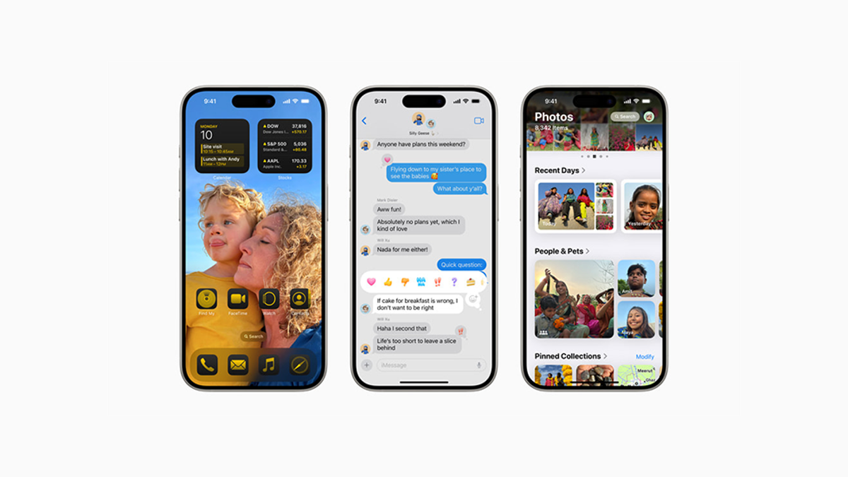
Yeah, the tinted icons are very refined as can be seen in this post: https://androiddev.social/@MishaalRahman/112594519877882594
It’s in beta 1. Some apps look kinda bad if you’re trying to pick a horrid color. Hopefully they do something to improve contrast before release.
I use an app to cycle through a dozen different backgrounds. Some of them have bold colours. Google handles it fine. I feel like Apple would tell me to manually set the right colour four times a day
Wow, one bugged icon. Get owned iSheep 😎